


Before you do anything else, start here. This guide is an overview of everything in the Build section of the Formstack Forms interface, helping you familiarize yourself with the basics of form creation and editing. Let’s get started!

How Do I Create a Form?
- To begin creating a form, click the "Create" button on the Forms tab (either in the top right or the middle of the page if no forms have been created yet). After selecting “Form,” you have the option to add the form name, URL, and language, which will be automatically populated. At any point, you can click “Start with blank form instead” at the bottom of the window to go directly into the builder.
- Next, choose a form type from our pre-built templates. Before it begins creating your form, select from default, light, or dark-stocked themes. If there is another theme you prefer to use, you can select it in the builder.
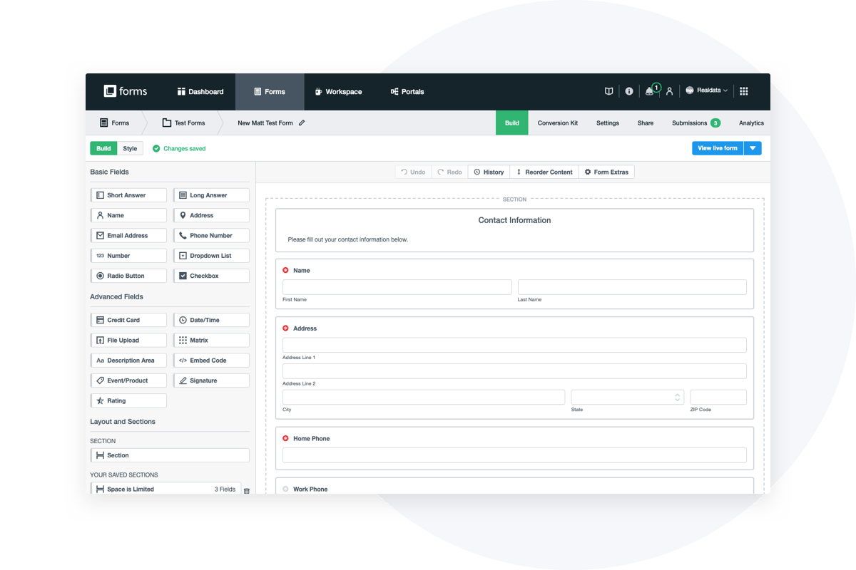
- Start building and adding fields by dragging them from the Form Fields menu on the left of the form builder.
- From there, you can add, edit, delete, copy, or move your fields using the window slide-out on the left.
Now that the basic skeleton is in place, it’s time to add the form fields that will bring your form to life.
Choosing Your Form Field Options
Long and Short Answer Fields
Two of the most common form fields are Short Answer and Long Answer. These options allow your users to submit their own responses.
Long Answer fields are for multi-line responses and large amounts of text, such as comment boxes. To add a Long Answer field, drag it from the Basic Fields menu on the left to the appropriate place on your form. The field label will be the question you are asking. You can change the width of the field by setting the number of columns and the height of the field by setting the number of rows.
Short Answer fields are intended for simple, single-line responses like first name, company name, etc. To add a Short Answer field, drag it from the Basic Fields menu on the left to the appropriate place on your form. The field label will be the question you are asking. You can change the width of the field by setting the number of columns and the height of the field by setting the number of rows.
Short Answer fields can also be used to do calculations. Select the Calculation option underneath the Field-Specific area to the left, and choose between a Date or Numeric calculation. Under the Default Value (Calculation) option, select from fields, numbers, and mathematical symbols to set up the calculation.
Dropdown List, Radio Button, and Checkbox
In addition to text fields, there are multiple ways to display a question with answer options:
- Dropdown List — Dropdown List fields are used to create a list of items that you want a user to choose from. You can either use a predefined list (such as state, age, days of the week, etc.) or create your own from scratch.
- Radio Button — Radio Button fields are used when you have a field that has several answer options, but you only want users to be able to select one of those options. (If you want them to be able to select more than one option, you would use a Checkbox field.)
- Date/Time — This is a place for users to enter either a date, time, or both (e.g., date of birth).
- File Upload — Here, users can upload a picture, document, or other file type to your form. Consider using this feature to allow users to upload cover letters and resumes for a job application form.
- Name, Email Address, Phone Number, Address — These fields are basic, but they’re absolutely necessary. Drag and drop as a quick way to add these to your form.
- Matrix — This is a rating field you can use in surveys and other forms where you want to allow your users to rate or rank multiple items in a single field.
- Number — Users can enter a number, which is useful for conveying currency.
- Credit Card — Process payments by making it easy for your users to input their credit card information.
- Description Area — Here is where you can insert rich text (photos, formatted text, links, etc.). Consider adding your logo, specially formatted information for your users, etc.
- Embed Code — Embed HTML, videos, maps, and widgets into the form.
- Signature — Allow users to conveniently and electronically sign a form.
- Section — Sections are used to help you break up the form so it’s easier to read. Add explanatory text or headlines to a set of fields, create a new page on a multi-page form, or change the layout on some fields without changing the layout of the entire form.
- Event/Product — Organize and set up events or products based on prices or available quantities, and adjust the handling after the availability has been depleted.
- Rating — Use this field when collecting customer feedback, evaluating the success of an event, or calculating a net promoter score (NPS).
Want to streamline your form building even further? Save the sections you create to use again! Just choose the “Save this section” button and store it with a name you’ll easily remember for future use (e.g., Payment Information or Contact Information). When you’re ready to use it again, simply drag and drop it from the Saved Sections area onto your form the same way you would a regular form field.
Make It Your Own
Your form is created! But by no means has it achieved its full potential. There’s still so much you can do to customize your form to your industry, company, or specific need. This may include:
Check out our relevant resources to learn how you can continue optimizing your forms for the greatest response rates and most reliable data.
Love Your Forms
At Formstack, we love forms—and believe you should love yours too! If you have more questions about form creation or advanced features, check out our library of resources, from our blog to our detailed support center.

If you still have yet to try Formstack Forms, trial it free for 14 days to demo our form builder and see how better customization can impact your brand.